Unlock the Secrets of Responsive Power Apps Form Design: A Beginner’s Guide
Are you a beginner exploring the world of Power Apps? If you’ve been wondering how to create mobile-friendly, responsive forms that work seamlessly on screens of all sizes, you’ve come to the right place. This guide will break down everything you need to know about Responsive Power Apps Form Design in simple, easy-to-understand language. By the end, you’ll have a good grasp of the basics and be ready to create your own responsive forms in Power Apps.
What is Power Apps?
Before diving into responsive design, let’s clarify what Power Apps is. Power Apps is a suite of applications, connectors, and a data platform including services like Power BI, Power Automate, and Power Virtual Agents. It offers you the tools to quickly create custom business applications that connect to your data stored either in the underlying data platform (Common Data Service) or across various online and on-premises data sources.
Introduction to Power Apps Form Design
Power Apps, a part of Microsoft’s Power Platform, enables users to build custom apps tailored to their business needs. One crucial aspect of any app is its form design, especially in today’s multi-screen world. A responsive Power Apps form ensures that your app looks and functions great on any device, whether it’s a desktop, tablet, or smartphone.
What is Responsive Design?
Responsive design refers to designing apps that automatically adjust their layout to look great on any screen size, from large desktop monitors to small mobile devices. This ensures a clean and user-friendly experience regardless of the device in use.
Why is Responsive Design Important?
In our digital age, users expect a seamless experience regardless of the device they’re using. Responsive design in Power Apps adjusts the layout, fonts, and images automatically to provide an optimal viewing experience across various screen sizes. This ensures better usability, client satisfaction, and operational efficiency.
Diving into Responsive Power Apps Form Design
Let’s break down responsive form design in Power Apps into simple, manageable steps.
1. Starting with Canvas Apps
To begin with responsive forms, you’ll be working within Canvas Apps in Power Apps. Canvas Apps allow you to create highly customized interfaces with drag-and-drop simplicity.
2. Setting Up the Layout
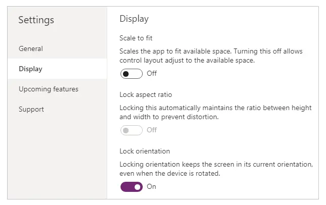
In your Canvas App, navigate to Settings > Display > Orientation. Choose between ‘Landscape’ or ‘Portrait’ mode depending on your app’s design requirements. The Scale to fit and Lock aspect ratio settings can be crucial for responsive behavior.
3. Using Relative Positioning and Sizing
Instead of hard-coding the size and position of controls, use relative units like Parent.Width*0.5 to ensure that everything resizes seamlessly. This makes your form adaptive to different screen sizes automatically.
4. Utilizing the New Responsive Containers
Microsoft has introduced responsive containers to Power Apps. These containers help manage the layout as the screen size changes. Think of these as wrappers for your form controls. You can stack, stretch, or wrap your controls within these containers to build a fluid, responsive user interface.
5. Testing Across Devices
Always test your form on various devices. Microsoft Power Apps provides a preview mode where you can see how your app will look on different screen sizes before finalizing it.

Power Apps UX Design Tips
Good design isn’t just about looks; it’s about ease of use. Here are some user experience (UX) tips for your responsive Power Apps forms:
- Keep it Simple: Focus on the essentials. Too many elements can make your form cluttered and confusing.
- Consistent Navigation: Ensuring a consistent navigation experience makes it easy for users to find what they’re looking for.
- Readable Text: Make sure your text scales well and stays readable on smaller screens. Stick to clear fonts and appropriate sizing.
Best Practices for Responsive Design in Power Apps
- Consistent Spacing: Use containers and consistent margins to place elements.
- Group Elements: Group related elements to maintain a structured layout.
- Testing: Always test your app on multiple devices.
- Minimum Viable Design: Start with core functionalities and then add additional features.
Mobile-Friendly Form Tips
- Bigger Buttons: Ensure form buttons are large enough to tap easily.
- Readability: Use legible font sizes and high-contrast colors.
- Optimized Media: Compress images and videos to improve loading times.
Creating Forms in Power Apps: A Step-by-Step Guide
Let’s walk through the process of creating a simple, responsive form in Power Apps.
Step 1: Create a New Canvas App
Start by logging into Power Apps and creating a new Canvas App from a blank template.
Step 2: Choose Your Layout
Select either a tablet or phone layout depending on your target devices.
Step 3: Add Forms and Controls
Drag and drop the form controls (e.g., text boxes, dropdowns, buttons) that you need onto your canvas.
Step 4: Configure Responsive Settings
Find each control’s Width, Height, X, and Y properties and set them using relative units. Use expressions like Parent.Width*0.5 for responsive sizing.
Step 5: Add Responsive Containers
Use Responsive Containers to group controls. This helps manage their layout and positioning as the screen size changes.
Step 6: Run and Test
Preview your app and test it on multiple devices to ensure it looks and functions as expected.
Conclusion
Designing responsive forms in Power Apps doesn’t have to be overwhelming. By understanding the basics of responsive design and using the tools provided by Microsoft Power Apps, you can create user-friendly, adaptable forms that provide a seamless experience across all devices. Remember, the key to success is to keep testing and iterating until you achieve the perfect responsive design for your users.
Frequently Asked Questions (FAQs)
How do you make a form responsive in Power Apps?
To make a form responsive in Power Apps, use relative positioning and sizing for your controls. Utilize responsive containers to manage layout changes and always test on multiple devices to ensure optimal performance.
What are the best practices for responsive design in Power Apps?
Best practices for responsive design in Power Apps include:
- Using relative units for positioning and sizing
- Leveraging responsive containers
- Keeping layouts simple and user-focused
- Consistent navigation
- Clear and readable text
Can I create mobile-friendly forms in Power Apps?
Yes, you can create mobile-friendly forms in Microsoft Power Apps by using responsive design principles. This ensures that your forms are adaptable to different screen sizes and orientations.
How do I optimize a form for different screen sizes in Power Apps?
Optimize your forms for different screen sizes by using the Width, Height, X, and Y properties with relative units. Group controls into responsive containers to manage layout changes seamlessly.
What tools can help in designing responsive forms in Power Apps?
Microsoft Power Apps provides several tools for responsive design, including responsive containers and property settings for relative sizing and positioning. Additionally, preview modes allow you to test your app on different screen sizes before finalizing it.
#MSFTAdvocate #AbhishekDhoriya #LearnWithAbhishekDhoriya #DynamixAcademy
References & Read More:
- Unlocking the Power of Generative AI in ERP: Your Complete Guide 2024
- The Ultimate Guide to Understanding Microsoft Dynamics 365 API Access Tokens for Beginners
- The Ultimate Beginner’s Guide to Microsoft Dynamics 365 Business Central
- Unleashing the Power of AI and Low-Code Development: A Beginner’s Guide
- Understanding Microsoft Dynamics 365 Field Service: A Comprehensive Guide for Beginners

1 thought on “Mastering Responsive Power Apps Form Design: A Beginner’s Guide 2024”